Post
We need to draw on our untapped ability
(or why drawing is important to the Economy)
From the Irish Examiner Monday, April 1st, 2013
I am a good drawer and have been since I was a teenager.
Last year, I worked in Presentation College, Carlow, doing a Percent for Art commission called SCHOOLWORK. Presentation is a secondary school. I offered to teach the students life drawing. I did classes with the third-years. Presentation has 20% foreign students — many of them Polish, all of whom could draw, many exceptionally. They could draw better than most Irish adults, even some who have been to art college.
The Polish students had done an hour of drawing a week in primary school in Poland, in addition to an hour a week of crafts. They had a specialised art teacher; they had specialist teachers in everything. These Polish students show that drawing is not innate; it can be taught. My drawing ability is the result of a misspent youth. I failed my Leaving Cert, but I got an A in art.
Drawing is, like writing, best learnt at an early age. In Irish primary schools, poorly resourced teachers cover drawing as one of six strands in the art curriculum. Because there is no book for art and little course support, it’s easier to do anything other than put a pencil in a child’s hand and teach them to draw. It’s a little late to start at secondary level.
Drawing is important — it’s not just for making pretty pictures, and it could save us all. How? At Presentation, I talked with woodwork technology teacher, Noel O’Neill, about the Polish students’ drawing ability. He said the Polish students constructed better projects in woodwork because their designs were better, and they better understood the initial plans, due to their drawing ability.
The media touts maths and science as the saviours of the Irish economy. But every product, package, vehicle, building or object you care to mention started as a sketch. From there, it became a fully conceived drawing and, finally, a product.
The i-Phone is the stand-out example. The technology is wonderful, but the physical form of the object and its interface make it the market leader. Both of these design factors arise from drawing. This is a matter of court record: during the recent Apple vs Samsung case in the US, it emerged that 15 designers meet weekly in Apple HQ and pass pencil drawings around. From these meetings, all of Apple’s product designs emerge.
Drawing is iterative. When you conceive of a new design for a chair, you do a little sketch. This sketch improves your mental concept of the object and suggests improvements. You do another sketch and this further solidifies the concept. Drawing is a stepping stone to making ideas real.
If you cannot draw competently, this blocks your ability to create. As a nation, we are creatively blocked because of low drawing competence. Drawing is the basic skill of so many careers that build products. From industrial design, to architecture, to package design, to the ads that market those products and the videos that present them, drawing is the fundamental skill that teaches you how to organise visual information.
As a society, and an economy, we are walking right past the money if we do not improve our drawing skills. It is like literacy. As a professional painter and drawer, I am the equivalent of a novelist, but everyone else should be able to draw the ‘equivalent’ of writing a letter. From that basic visual literacy, many people, possibly a third of the population, who have no aptitude for maths or language, could grow into great designers, visualisers and creatives.
If I was given the chance to do a social experiment, I would run a school in which art replaced maths for five hours a week, and maths was a treat on Fridays if everyone was good.
*Blaise Smith is a painter and an associate member of the Royal Hibernian Academy. See his work on www.blaisesmith.com
© Irish Examiner Ltd. All rights reserved
HOW I PAINT
This is the essay from the catalogue for my 2004 show in the Molesworth:
There is something magical about rural places. They have that stillness, held, when you find yourself among trees, or buildings where people have worked for generations, adding a mark here, a roof there. How to hold it and convey it ?
I use paint. Placed on to a flat surface to correspond to observations I make about what is before me. I am using my own eyes and I am really standing there, in the place, in front of the Farm for as long as it takes to complete the painting.
Most people are surprised to learn that I paint everything directly from life. The painting of the sheds in Castlewarren was begun in early March 2001. Each year at around the same time I would return to work on it for another couple of months, as long as the weather was with me. Most people assume that I work from photographs but I don't. There actually isn't enough information in a photograph. Besides, because I am there, I hear all the history and stories about the place from the people who live there. This gives me a greater understanding of what I am looking at and trying to depict.
I began the work on this group of paintings about three years ago. I had just completed ten landscapes for the Kilkenny County Council Millennium commission and I realised that I wanted to concentrate more on the rural buildings. It's the buildings that really got me going; the way they are set in the land. It's not surprising since my early memories of drawing were on plans and elevations that my architect father gave me.
I also wanted to do paintings on a bigger scale and take them right through the pain barrier to a point where I had nothing further to add.
I spent a fair amount of time, nearly a year, driving around Kilkenny looking for the kind of thing I was looking for. This thing I was looking for wouldn't be apparent until I was looking at it. Then I¹d do some drawings and take a few photographs and try and remember how I¹d got there from home in order to retrace my steps.
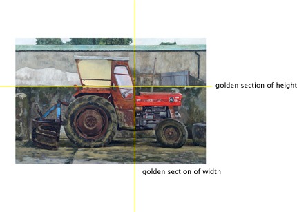
I then decide the composition and choose the size of panel. I recently read The Painter's Secret Geometry, a study of Composition in Art, by Charles Bouleau¹, kindly lent to me by Walter Verling, which was a good steer, as they say. Many of my paintings are constructed around divisions of the Golden section, (1:1.618) or the armature of the rectangle, in thirds and quarters. These proportions are useful because they were used by the old masters and since every image we've ever seen is based on these early compositions we are so trained to expect them that they seem almost inevitable and "natural". I find this a very helpful device to hold together a big picture of something new, in the same way that a musical composition using the structure and cadences of J.S.Bach seems "right".
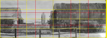
Sometimes these grand designs were simply set aside and I just drew it as it felt right like Naddy's, Ladywell Street.
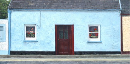
I tend to avoid diagonal lines and triangular areas. I like strong horizontals and verticals which have a kind of settling effect. It's no accident that Vermeer's later works, featuring few and very shallow diagonals, are perceived as serene.
I paint on a panel made of MDF and layered with about five coats of Gesso which is made of rabbit skin glue and whiting applied over a couple of days. This is then sanded and burnished to a smooth finish. It's the same as the support in a Holbein or Van Eyck except they would have used oak. These days oak is not cured for long enough to provide a reliable support and MDF is recommended by all the manuals². It has the advantage that it will not split or form hairline cracks along the grain.
Once the format is decided and I am "on location" I sometimes outline the painting in pencil - but I prefer if I can draw it in with a big round brush to begin with. I use a very thin oil colour to do this thinned with turpentine the colour I use for this is based on the overall painting generally a broadly complementary opposite - so burnt sienna for green and so on. But sometimes I just let my eye tell me so purple under the big green sheds. Pretty rapidly I start blocking in areas of colour and trying to anticipate the action of this undercoat with later layers. I try to assess the brightest areas of colour and leave these alone. I will paint them in with a thin transparent film (oil paint thinned with cold pressed linseed oil) later on and hopefully allow the white ground to shine through. The white ground acts like light behind stained glass (the oil film). This would be the procedure with most skies for example.
Getting the paint on in the initial stages is the most frustrating part. I just can't get it on fast enough. Large patches of white panel showing through are very unbalancing so I am always trying to fill them in with some sort of "lowest common denominator" colour. This helps to gauge the value of the colour next to it. I often paint the skies in first for the same reason. Every now and again I'll take whatever colour is on my brush and put a few strokes here and there all around the panel this will later homogenise the overall painting.
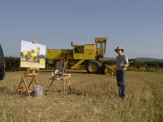
I generally have at least two paintings on the go at any one time one for a dull day and one for a sunny day. There's always an indoor painting in progress in case of bad weather. I am a dedicated follower of the weather. I need to have the right weather for a few hours at a stretch because once I get there it takes about half an hour just to get everything out of the van. Depending on the size of panel I always bring two easels: the sketching easel which I use as a paint-box, and one of three others: A traditional large tripod, a small studio easel, or the big studio easel for the big stuff a real brute.
With these paintings on big panels wind is the enemy. A few of them have wound up face down in the dirt after an unexpected gust. In fact wind is the most irritating natural element I have to contend with; the weather may be beautiful but the painting is like a sail - even the palette is being wrenched around nearly taking my thumb off in the process. On top of that I can't really put brush to panel because the painting is shuddering and leaping about.
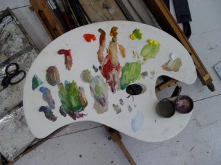
I use a traditional palette, weighted (a vital feature so that you can use it on your arm and it balances it flat so it doesn't twist your arm). There is a reason that this type of palette was favoured in the past because as you mix, the colours are just below your eye-line and you can more readily compare them to the subject. I also re-paint the palette white regularly.
I used to mix my own paints from pigment powder. This was time consuming although instructive. I recently began using Michael Wilcox paints, which are definitely the best I have ever used. I have also begun using his terrific system for mixing colour explained in his book Blue and Yellow don't make Green³. He completely does away with the sort of arcane knowledge whereby most painters pick up interesting colour combinations or mixes by trial and error. His system really works and he convincingly argues that all the colours can be mixed from just 12 colours, which are the only ones he makes. Having used them for the last ten months I am inclined to agree. They have also been chosen to provide the best possible light-fastness. He is a sort of Dyson of Artist's Materials.
For the record (and because I like finding out what other painters use) the colours on my palette are from left to right: Ultramarine Blue, Cerulean Blue, Burnt Sienna, Quinacridone Red, Cadmium Red, Raw Sienna, Yellow Ochre, Cadmium Yellow Light, Hansa Yellow and Titanium White. Some of these are hard to get and I strongly recommend checking out www.schoolofcolour.com..
His system can be seen in use in the combine Harvester. When I painted machines for the Roadworks Commission they were the same kind of light warm Yellow but I always found the colour of shadows in this Yellow very elusive. Back then I used to mix all day with all manner of colours on the palette trying to get this colour. By the time I had got it I wouldn't have a clue what combination was in there and it would be virtually impossible to mix up more of the same. In one fell swoop Michael Wilcox gave me the solution. Basically you darken any given colour with its complementary opposite. So, the shadows on the Combine are very simply a warm purple made of Quinacridone Red and Ultramarine mixed into the Yellow, with greater amounts of Burnt sienna added to eliminate more and more reflected light ultimately giving a rich but transparent black. This colour combination of the purple in opposition to yellow informs the entire painting, in the sky, in the shadow on the stubble, and the whole thing was initially sketched in with purple.
Colour harmony is the endgame of painting. Long after drawing and likeness what I am longing for is harmony in the colour scheme this is a bit like composing a piece of music so that it stays in tune it does not necessarily have to be in the same key throughout but it must logically set up the expectation of a key change. If this is successful then the change will sound right and won't jar. In earlier paintings I had a lot of problems with bum notes i.e. colours that sounded out of key, but I feel that this group of paintings has gone a long way toward solving that. I do look for subjects and groups of objects where there is already a colour harmony. I am still trying to address it and it will probably take the rest of my life.
As the painting progresses I am using more and more oil and the film is getting thinner and more transparent. This final stage is where the subtle effects the finish - comes in. In fact it never ceases to amaze me the dividends paid by glazing, particularly in portraits.
Many people ask me why I don't sign my paintings. Well, I do, but on the back. It seems a pity to me to have expended all this time and effort to make a picture to go putting some writing on it. These days most people seem to spend more time reading the label than looking at the paintings in most National Galleries. There is a pictorial language that is fragile and should not be disturbed by our imposition of terms.
The way one of my paintings comes out in the end is invariably a surprise to me. I have no idea how they come to be like that. I can tell you what I did but I couldn't say or describe how I arrive at a particular point. Presumably the painting itself is that description. I feel that I just work until I get a result. However, all the time, I am actually standing there, looking, and it is this consistent observation of a thing, otherwise ignored, that gives these works a validity and a value, at least to me. I believe it is important that someone is taking the time to look at this stuff. During the making of a painting, over a period of weeks or months I am gradually adding more and more information about the subject, layer upon layer. I am also making value judgements this part looks best, now, this moment, just as the light hits the hillside, just so. I'll put it in. A painting is a conglomeration of firsthand information. Its surface is made up of hundreds of thousands of individual observations and the attempt to recognise, record and organise them. It is this surface quality that gives painting a fundamental advantage as a medium. When the painting is hung on the wall it gives back these bits of information at the rate in which it was recorded because each mark must be evaluated by the viewer.
Blaise Smith,
Wednesday 6th of October, 2004
Footnotes
1. "The Painter's Secret Geometry, a study of Composition in Art" by Charles Bouleau, Pub. Thames and Hudson 1963.
2. Two terrific technical manuals are: "Artists' Materials, Which, Why and How" by Emma Pearce. Pub. A&C Black, London. ISBN 0-7136-3554-1 ( a good recommendation from Carey Clarke) and "The Painter's Handbook" by Mark David Gottsegen,. Pub. Watson-Guptil publications. ISBN 0-8230-3003-2
3. "Blue and Yellow and Yellow don't make Green" by Michael Wilcox, Pub. The Michael Wilcox School of Colour. ISBN 0-9679628-7-0. This book, oils and watercolours and many other publications available on www.schoolofcolour.com. I do not, sadly, have shares in this company.